Infinity Letter Systems: Stroke, Returns & Even Depth Across a Wordmark
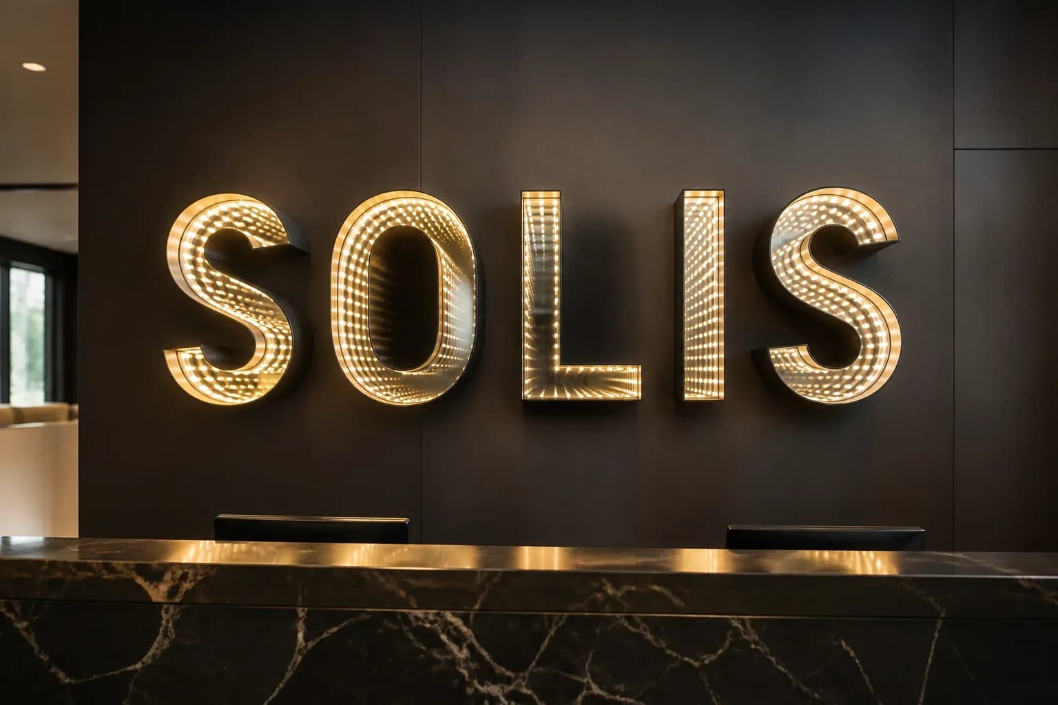
How to specify infinity letter systems so stroke width, return depth, and per-letter optical cells keep even tunnel depth across a full wordmark — before fabrication locks the geometry.
Why wordmarks fail when letters are treated as one box
An infinity letter system only reads as a brand when every character shows the same tunnel depth. Buyers often approve a pretty rendering of the word, then treat stroke, returns, and glass spacing as shop details. After aluminum is bent and LEDs are laid, thin counters go dark, wide stems bloom too early, and guests see five different illusions instead of one wordmark. That is not a controller problem — it is geometry that should have been locked in the RFQ.
This guide is for brand teams, sign contractors, architects, and venue operators specifying infinity letter systems for reception walls, storefronts, and nightlife wordmarks. Product pages own the commercial offer; here we map the fabrication variables that keep even depth across the set: minimum stroke for optical cells, matched return depth, per-letter LED layout, and how to validate the word before metal is cut.
Stroke width: the floor that makes an infinity cell possible
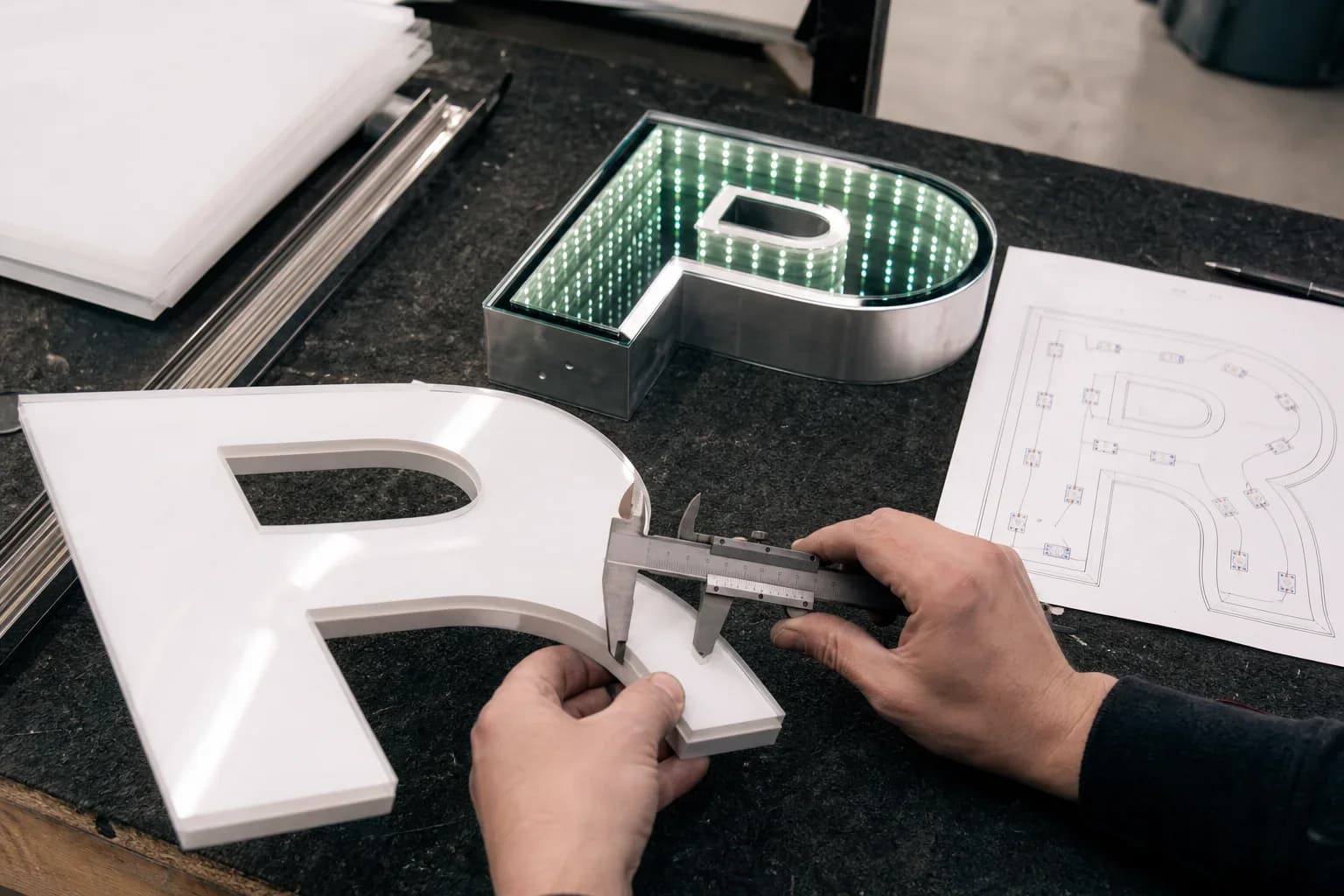
Stroke is the usable path width inside each letterface. Infinity optics need room for a front two-way mirror, a rear mirror, LED modules along the cavity, and enough edge clearance so reflections do not clip. When a brand font drops below that floor — hairline scripts, ultra-light sans, tight counters in A, R, or B — the tunnel collapses into a glow rim or a muddy haze. Thick display cuts are easier; condensed retail fonts almost always need stroke thickening or selective redraw before they become buildable infinity letters.
Call stroke out in millimeters on the elevation, not only as a font file. Mark the thinnest legal stroke after fabrication allowance, and decide early whether design will thicken stems, open counters, or refuse the face for this optical path. A logo that works as vinyl or channel-letter face acrylic may still fail as an infinity cell. The nightlife tunnel letters case we documented for bars follows this discipline: stroke and LED pitch were tuned per character so tight counters still stacked light instead of going dark mid-word.
Serifs and sharp terminals need the same honesty. A slab that looks bold in print can still leave an optical dead zone where the LED cannot turn the corner without a hotspot. Prefer simplified terminals for infinity letters, or accept local stroke rebuilds on problem glyphs while keeping the overall word weight. Document those rebuilds on the shop drawing so brand reviewers are not surprised when the fabricated I or K differs slightly from the marketing PDF.
Returns & cavity depth: match the stack across every character
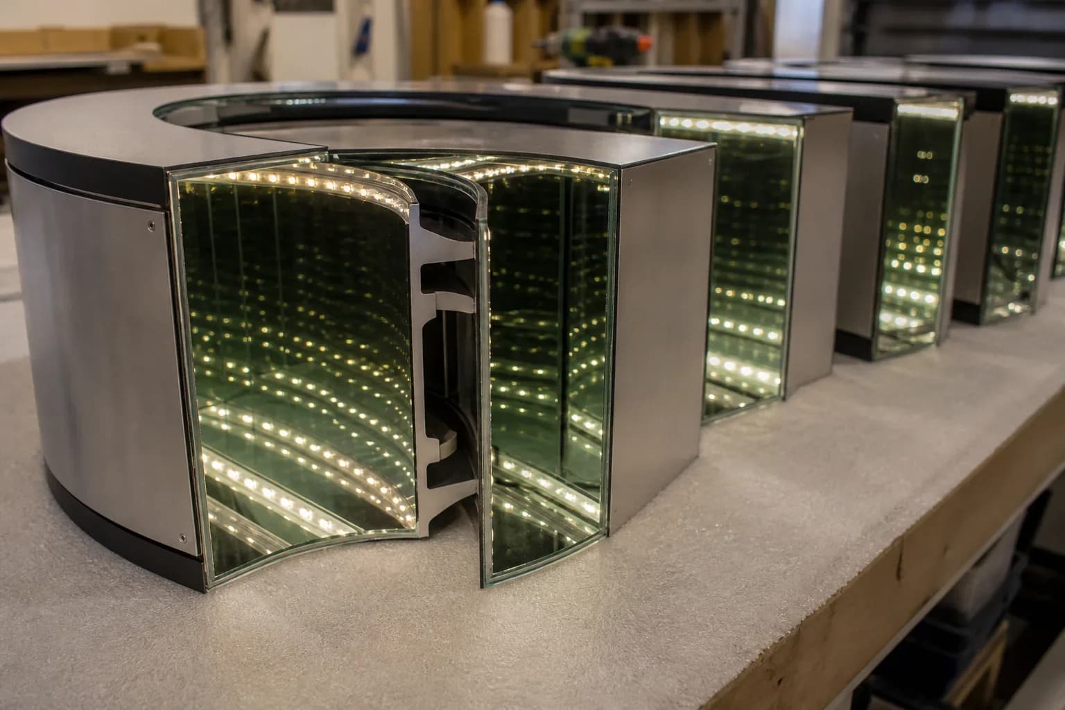
Returns are the side walls that set physical depth. For infinity letter systems, return height is not a styling choice alone — it sets how many reflection steps guests perceive before the tunnel fades. If the O is built deeper than the I to “make room for LEDs,” the word reads as uneven architecture under camera and haze. Spec one target cavity depth for the set, then engineer LED count, diffuser strategy, and glass spacing inside that envelope so every letter lands on the same perceived depth.
Keep return finish language consistent too: brushed, painted, or powder-coated sides that match the room, with seams and fasteners planned so service does not scar the face. Mounting method — flush niche, standoffs, or raceway-fed — must not force different cavity depths letter to letter. When landlord or millwork caps overall projection, reduce the shared depth for the whole wordmark and re-validate the optical stack; do not shave only the narrow characters.
Heat and service ride with return geometry. Continuous-run venues need driver placement and thermal path that do not force deeper returns on some letters just to hide bricks. Keep power and data in a chase or raceway sized for the set, and leave labeled access that does not require opening the optical face. Pair this with the same continuous-run discipline used on feature walls — even depth means even duty cycle across every cell.
Per-letter optical cells vs a shared cavity word
True infinity letter systems build each character as its own optical cell. That keeps kerning flexible, lets installers level letters independently, and contains a failure so one dark letter does not kill the whole word. A shared-cavity plaque with cut-out letter windows can look related in a rendering, but depth and brightness then fight one common glass gap — counters and stems rarely balance. Use shared cavities for graphic panels; use per-letter cells when the brief is a dimensional wordmark with endless tunnels.
Even with per-letter cells, the set must be commissioned as one system. Match glass spacing, LED color temperature or RGB personality, and driver loading so adjacent letters do not drift warm/cool or bright/dim. For RGB or DMX venues, address blocks and zone maps should still treat the wordmark as a unit — the same sync discipline covered in our nightclub tunnel guide — while fabrication keeps each cell optically independent.
Validate even depth before you approve the shop drawing
Ask for a per-letter optical map on the shop drawing: stroke minima, return depth, glass gap, LED pitch, and any local thickening. Prefer a lit mock-up or photo set of the thinnest and widest characters side by side under the intended ambient light — lobby wash versus dark club haze produce different forgiveness. Camera review matters: phone sensors exaggerate hotspots and uneven tunnels that guests will still photograph.
Reject drawings that show one generic section for “typical letter” when the wordmark includes closed counters, diagonals, or a narrow I. Those shapes need called-out LED routes and edge clearances. If the brand cannot accept redraw, say so early and pivot to a different illumination path rather than shipping a word that never reads even.
Install sequencing is part of validation. Confirm letter centers, baseline, and standoff or niche reveals on the elevation so optical depth is not skewed by a tilted mount. After hang, run a full-white or brand-color check across the word before millwork closes around raceways — correcting a bright L next to a dim S is cheaper with the wall still open.
What to send so the wordmark fabricates as one illusion

A useful RFQ for infinity letter systems includes the vector wordmark and font, target letter height, mounting surface and projection limits, indoor versus outdoor exposure, static white versus RGB/DMX, destination voltage, and photos of the install wall. Call out which strokes are sacred to brand guidelines and which may be thickened for optics. Note viewing distance and ambient light — reception daylight and nightclub haze need different LED density inside the same return depth.
Send those inputs to InfinityMir when a lettered infinity wordmark is on the table. We respond with a fabrication-ready map — stroke minima, matched return depth, per-letter optical notes, control and driver intent, and packing assumptions — so the tunnel depth guests see stays even from the first character to the last.
Related capability
Nightlife tunnel letters caseManufactured Product Catalog
Explore Infinity Mirror Product Lines
Browse our full range of custom infinity mirror signs, letter systems, and feature walls — engineered with CAD shop drawings, UL/CE compliance, and export packing.
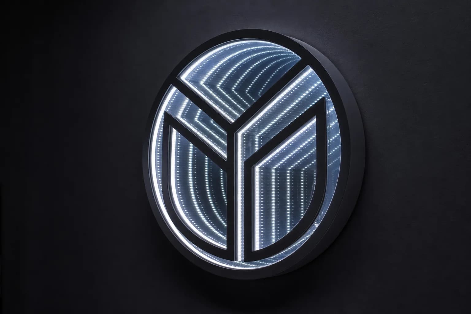
Infinity Logo Signs
Turn your brand mark into a custom infinity mirror logo sign — optical-grade glass, tuned LEDs, and endless depth engineered from vector artwork.
View Infinity Logo Signs details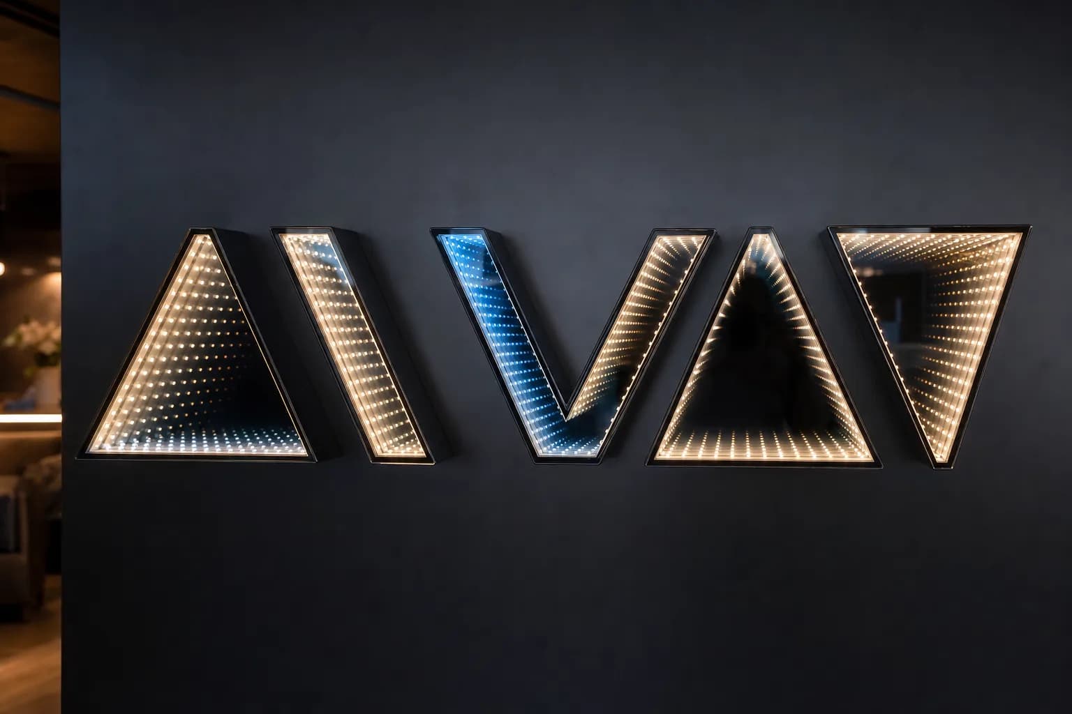
Infinity Mirror Letter Systems
Custom infinity mirror letter systems and channel signs built as individual optical cells for even depth across the whole wordmark.
View Infinity Mirror Letter Systems details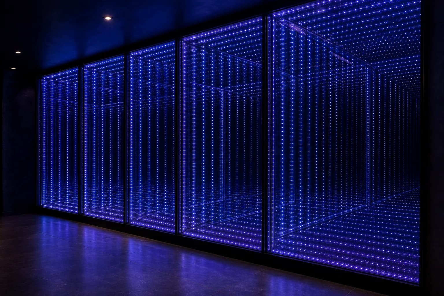
Feature Walls & Portals
Large-format infinity mirror feature walls and portals with synchronized multi-zone control, 24/7 heat management, and hidden service access.
View Feature Walls & Portals details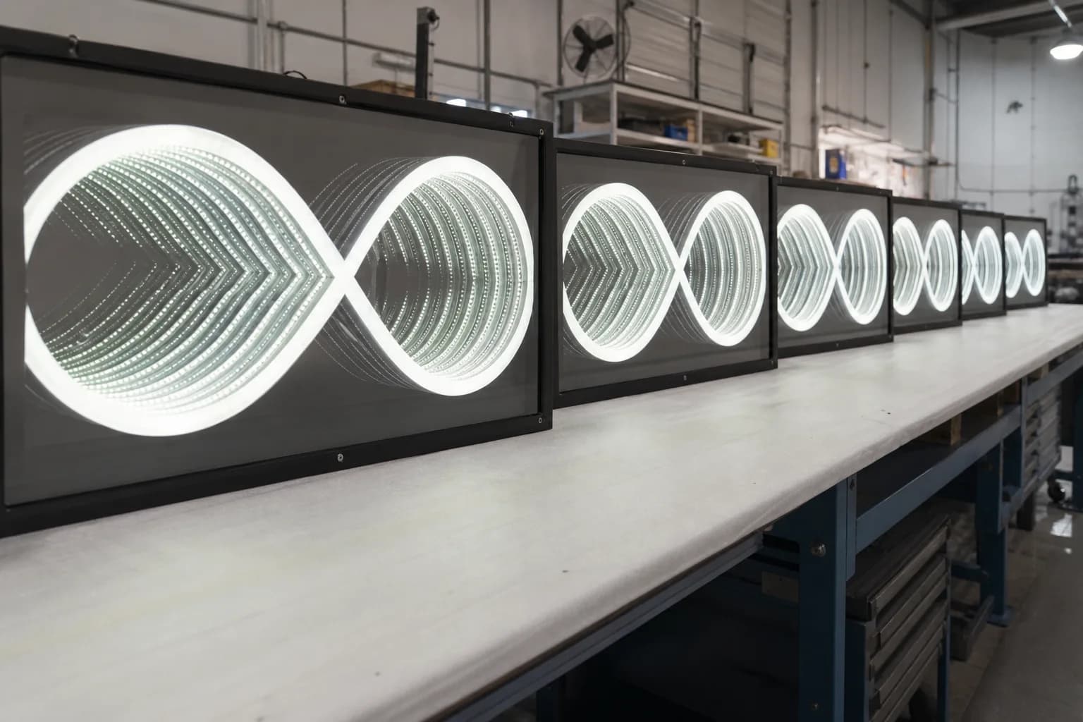
OEM & Rollout Programs
Private-label OEM & multi-location infinity mirror rollout programs with golden samples, controlled BOMs, and UL/CE electrical paths.
View OEM & Rollout Programs details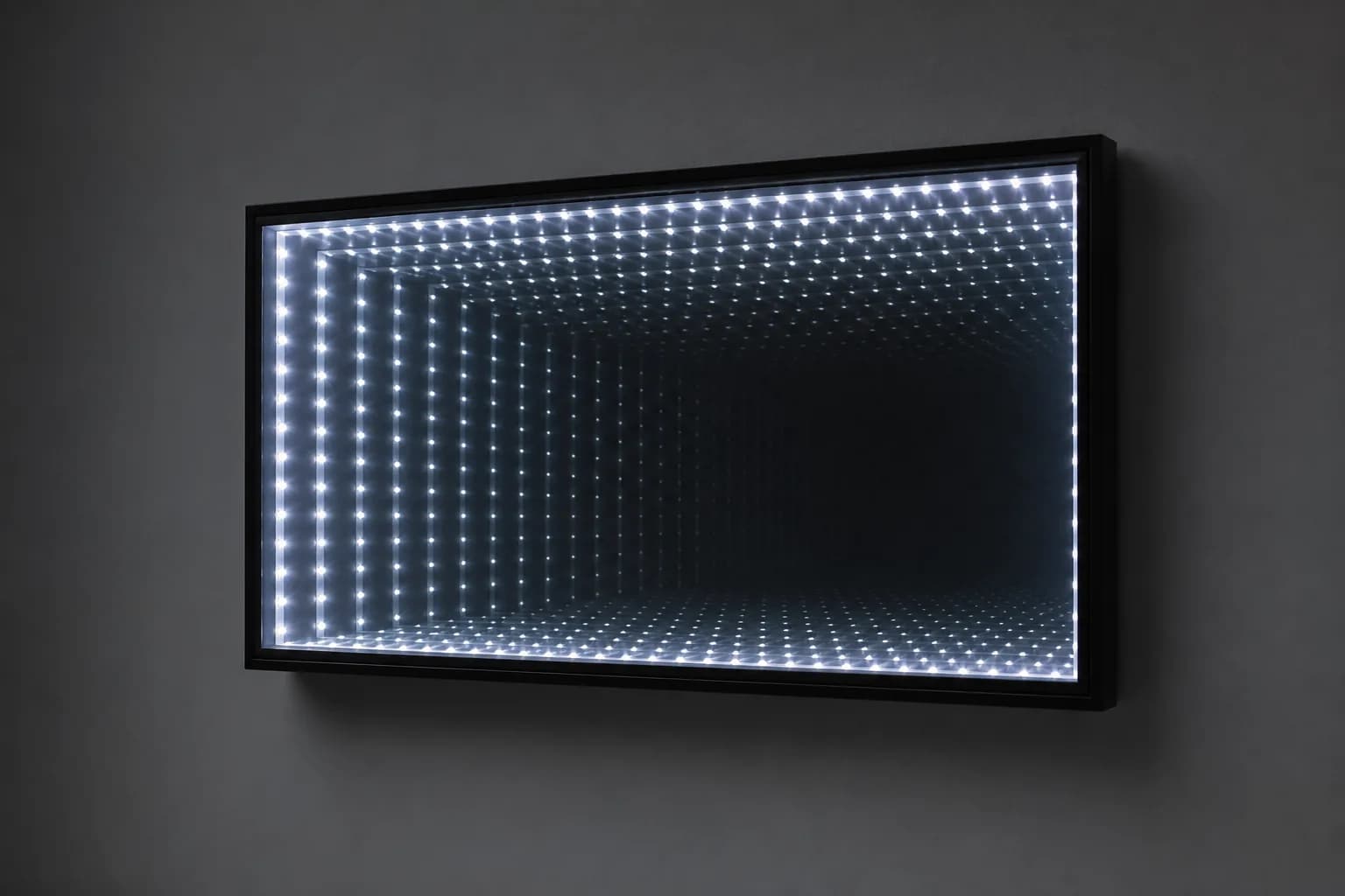
Standard Focal Panels
Fixed-size, ready-to-order standard infinity mirror focal panels with standard drivers and mounting kits for fast, predictable projects.
View Standard Focal Panels details