Infinity Mirror vs LED Lightbox and Channel Letters: How to Choose
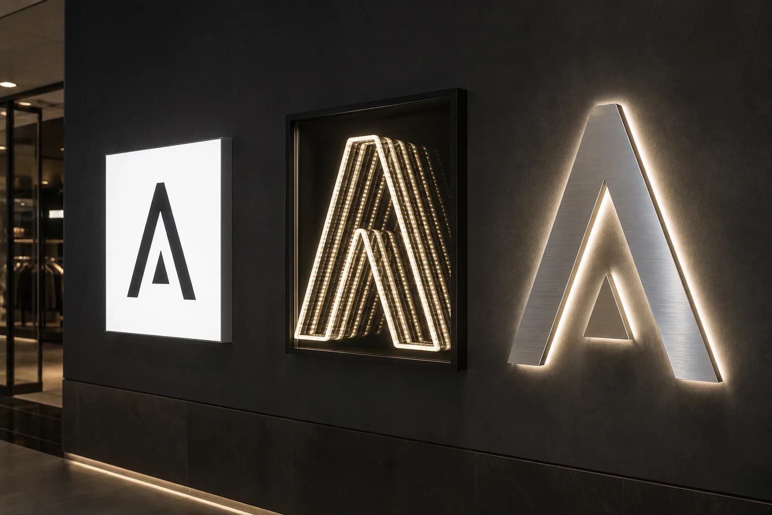
A procurement-minded comparison of infinity mirror vs lightbox and channel letters — depth vs graphic swap vs façade ID — so brand, GC, and design teams pick the right tool before the wall closes.
Why these three get confused in the same RFQ
Brand and design teams often write “something glowing with our logo” into a brief and get three incompatible quotes back: a flat LED lightbox, a set of channel letters, and an infinity mirror cell. Each can carry the mark. Each fails differently when the job was actually about depth, campaign swaps, or street-facing ID. Mixing leftover stock across those intents is how a flagship reads as two brands after dusk — or as a pretty tunnel that nobody can find from the curb.
This guide is for retail development, hospitality design, architects, and sign contractors who need a clear infinity mirror vs lightbox vs channel letters decision before millwork, electrical, and landlord review lock the wall. It stays on selection and fabrication consequences — not a product landing page — so you can name the primary job of the illuminated piece and stop paying for the wrong optical path.
What each technology actually does on the wall
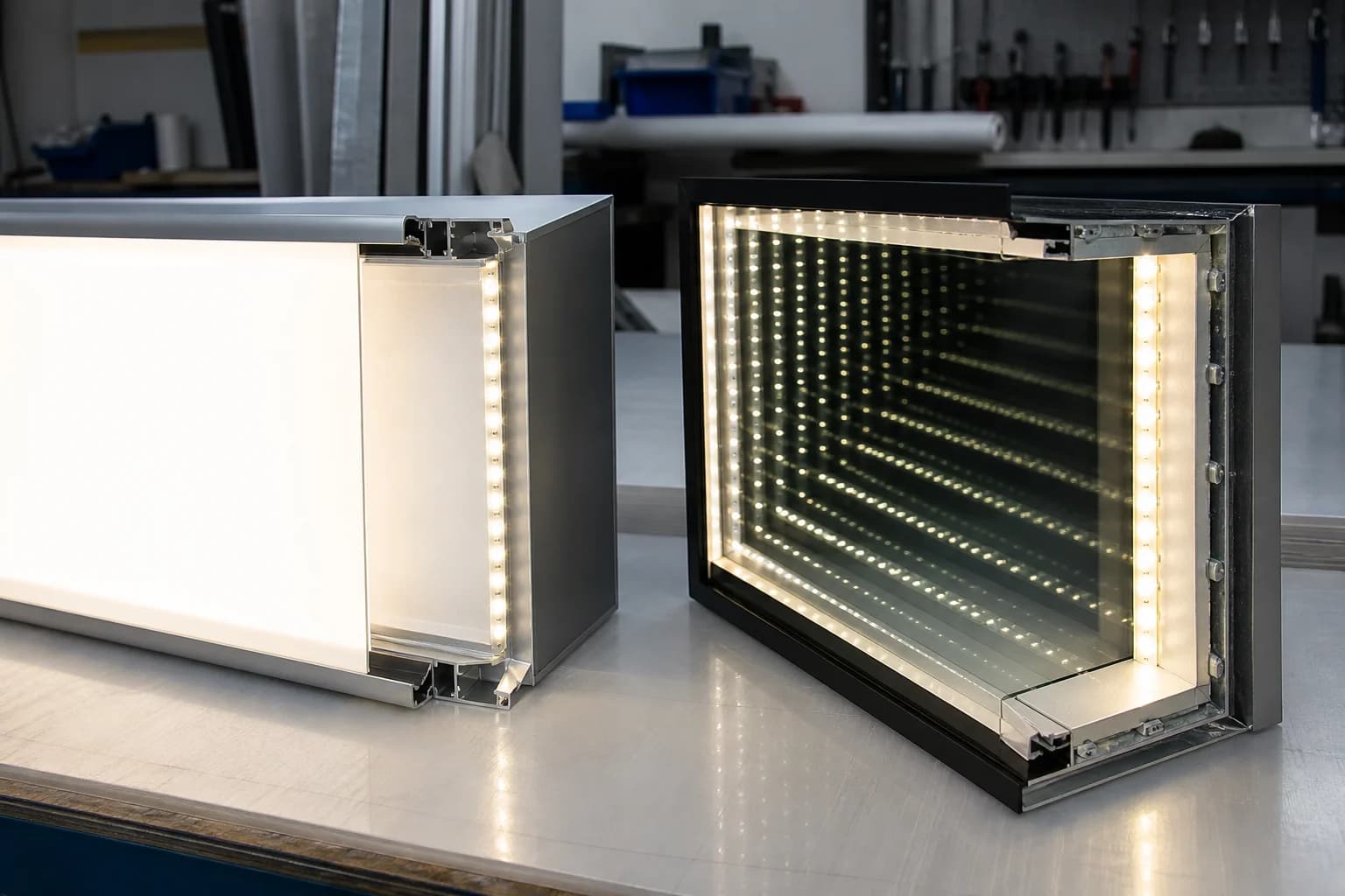
An LED lightbox (SEG fabric, acrylic face, or similar) is a shallow illuminated plane. Its job is even face brightness, fast graphic change-outs, and campaign cadence. Depth is measured in millimeters of frame, not meters of perceived tunnel. When the brief needs seasonal artwork, menu boards, or retailer-controlled face swaps, the lightbox wins on speed and cost of refresh.
Channel letters are dimensional ID. Front-lit, halo, or reverse-lit returns put the brand name in space with clear stroke, landlord-friendly protrusion, and daytime silhouette. Their strength is approach-distance legibility on a façade or pylon — not a photographable cavity of stacked reflections.
An infinity mirror cell is an optical stack: rear mirror, controlled one-way front glass, and a hidden LED plane that builds repeated rings of light. Its job is depth and a brand moment — the entrance selfie, the lobby pause, the exhibition stop — not swap-speed or curb ID at fifty meters. Speccing it as “just a fancy lightbox” underprices coatings, parallel spacing, and service access, then over-promises on graphic flexibility the glass stack never had.
Infinity mirror vs LED lightbox: depth versus graphic cadence
Choose a lightbox when campaign graphics change often, when AHJ or landlord rules prefer a sealed shallow cassette, or when the face must stay a flat illuminated panel for merchandising. Fabric and acrylic paths make print cycles cheap; SEG gaskets and hinged doors keep facilities in control. The failure mode of forcing an infinity cell into that role is obvious: you cannot peel a tunnel for next month’s campaign without rebuilding the optical stack.
Choose an infinity mirror vs lightbox when the brief names perceived depth, camera-readable rings, and a fixed or slowly evolving mark. Ambient light matters more here — bright retail grids wash shallow tunnels — so viewing corridors and sample review under store-like lighting belong in the RFQ. Thermal paths and driver access also sit inside a sealed glass cavity; treat continuous-run heat as a facilities line item, not an afterthought.
Budget and lead time diverge for the same overall size. A lightbox quote is mostly frame, LEDs, diffuser, and print. An infinity quote is glass counts, coating grade, parallel spacing, diffusion that erases diode dots on the first ring, and a frame that holds optics flat after freight. If two bidders look wildly apart, they are probably not pricing the same stack — ask which optical variables were assumed before you pick the low number.
Infinity mirror vs channel letters: brand moment versus façade ID
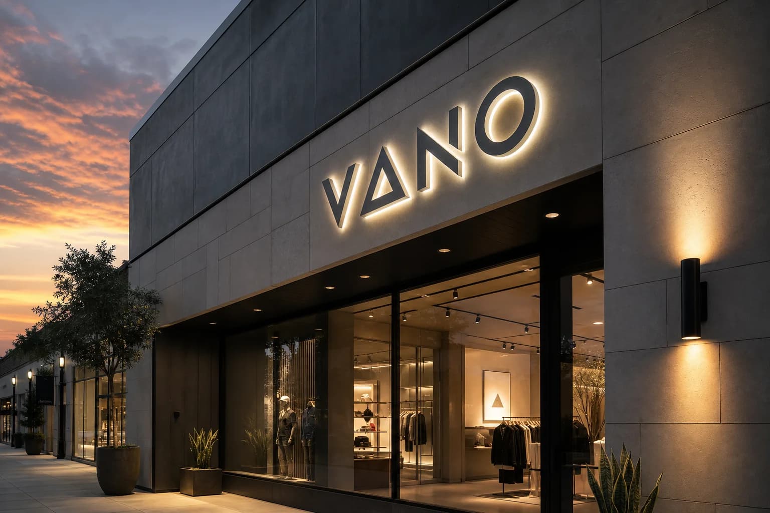
Channel letters own the street and the approach. They read in daylight silhouette, survive landlord protrusion caps with documented returns and standoffs, and map cleanly to Class 2 circuits your electrician already sequences on multi-tenant façades. Ultra-thin wordmarks and long names that need stroke clarity belong here — not inside an optical cell that needs a continuous light band to stack reflections.
An infinity mirror vs channel letters decision flips when the primary audience is already inside the venue: lobby, VIP corridor, fitting-room exit, booth focal wall. Depth and phone cameras beat curb ID. Thin serifs and dense micro-type still fail in a tunnel — the artwork readiness rules for infinity logo cells apply — so many programs light a bold icon as the infinity moment and keep the full wordmark as conventional letters beside it.
Electrical and mounting also diverge. Letters hang or flush-mount with accessible raceways; infinity cells need cavity depth, flat glass, and concealed service so drivers can be swapped without tearing the face. Landlord caps that ban deep niches may force a shallower stack or push the infinity piece indoors while letters stay on the façade. Name that split early so the elevation does not pretend one assembly does both jobs.
When hybrid programs beat a single illuminated type
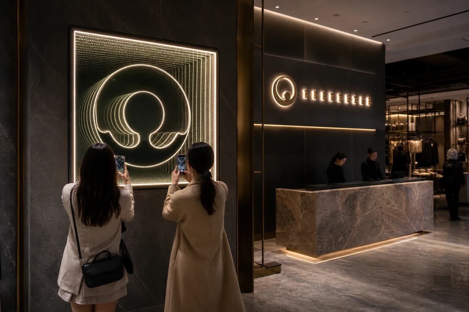
Most flagship and hospitality briefs are hybrid whether the RFQ admits it or not. A common pattern: infinity logo cell as the photographable depth moment on the feature wall, channel letters for the wordmark on the fascia or above reception, and lightboxes where menus or seasonal graphics must change. That mix is not indecision — it is assigning each technology the job it already does well.
Coordinate finishes across the three so the program reads as one brand after dusk: shared Kelvin or pantone intent, consistent metal language on frames and returns, and control tiers that match how facilities actually run the space. Fixed brand color on the infinity cell with optional scenes is usually enough; reserve full RGB or DMX for venues that staff will operate. Campaign lightboxes should not fight the tunnel for attention under the same track spots.
For multi-location rollouts, freeze which locations get the infinity moment versus letters-only or lightbox-only packages. A golden sample on the optical cell and a labeled BOM for letters and cassettes keep serial QC honest when US and EU stores share artwork but split driver listings.
RFQ inputs that make quotes comparable
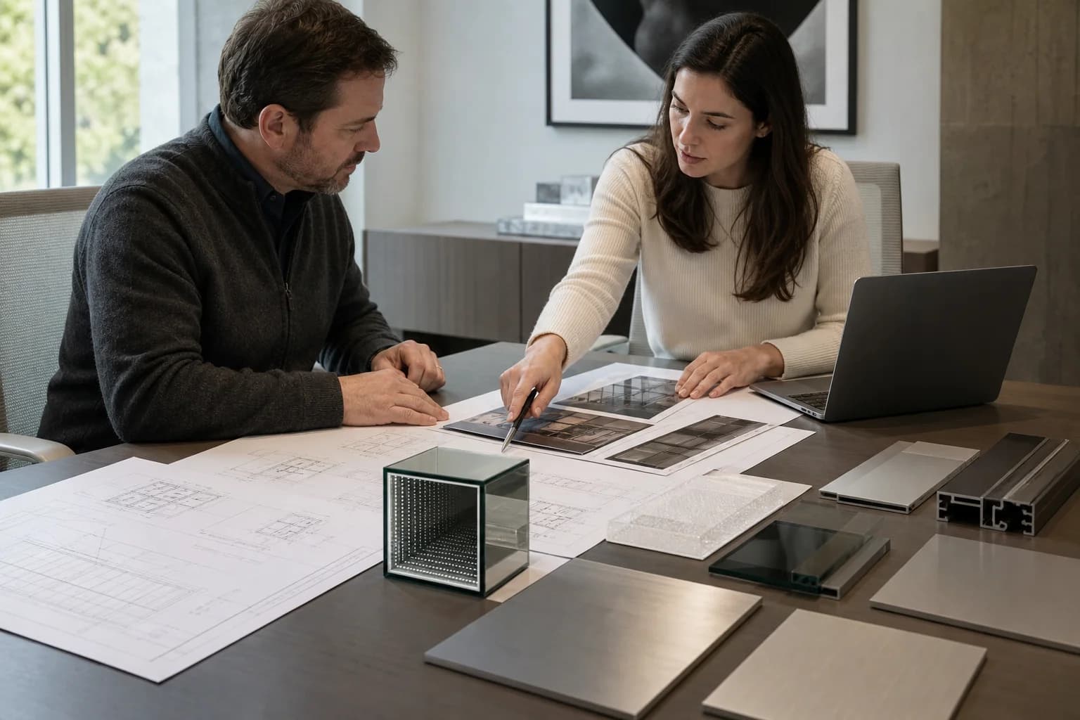
A useful RFQ names the primary job of each illuminated piece: depth moment, graphic swap, or façade ID — not “glowing logo” alone. Attach vector artwork, overall sizes, approach and interior photos, ambient-light notes, wall section or millwork depth, destination market and supply voltage, landlord or franchise caps, and whether campaign faces must change on a schedule. Call out hybrid intent when letters and an infinity cell share one elevation.
Send those inputs to InfinityMir when the depth moment is on the table. We respond with a fabrication-ready map for the infinity stack — optical assumptions, LED and driver intent, mounting and service access — and clear language for where a lightbox or channel-letter path remains the better tool, so your GC sequences the right trades before the wall closes.
Related capability
Explore InfinityMir capabilitiesManufactured Product Catalog
Explore Infinity Mirror Product Lines
Browse our full range of custom infinity mirror signs, letter systems, and feature walls — engineered with CAD shop drawings, UL/CE compliance, and export packing.
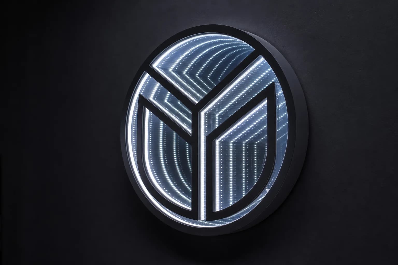
Infinity Logo Signs
Turn your brand mark into a custom infinity mirror logo sign — optical-grade glass, tuned LEDs, and endless depth engineered from vector artwork.
View Infinity Logo Signs details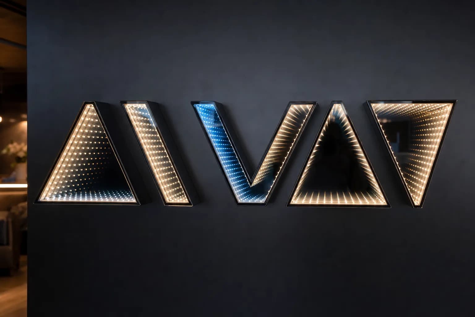
Infinity Mirror Letter Systems
Custom infinity mirror letter systems and channel signs built as individual optical cells for even depth across the whole wordmark.
View Infinity Mirror Letter Systems details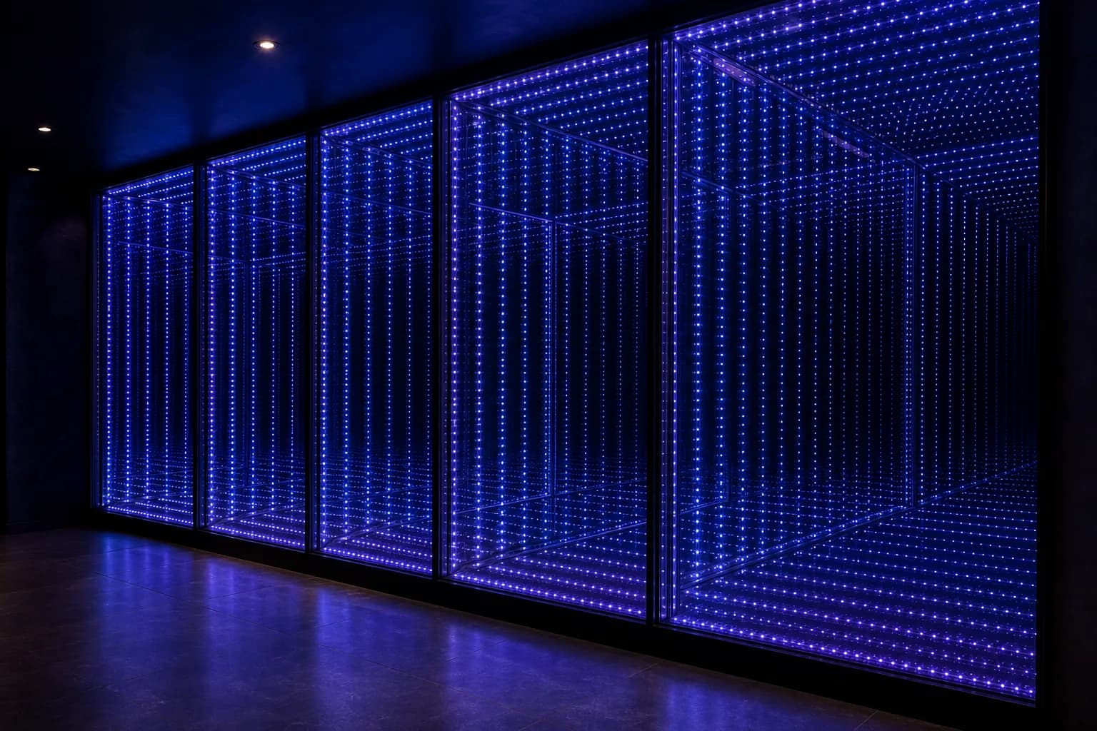
Feature Walls & Portals
Large-format infinity mirror feature walls and portals with synchronized multi-zone control, 24/7 heat management, and hidden service access.
View Feature Walls & Portals details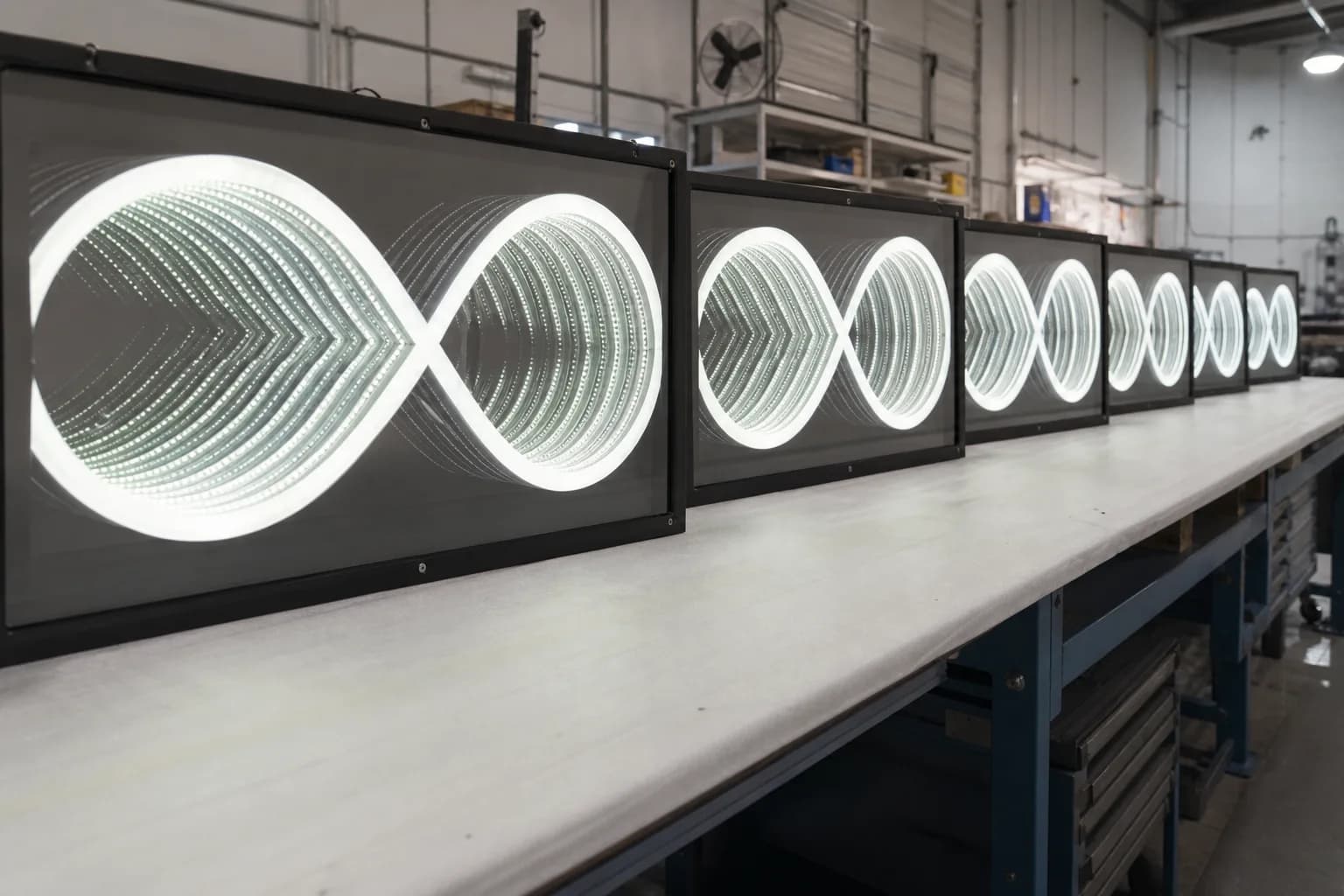
OEM & Rollout Programs
Private-label OEM & multi-location infinity mirror rollout programs with golden samples, controlled BOMs, and UL/CE electrical paths.
View OEM & Rollout Programs details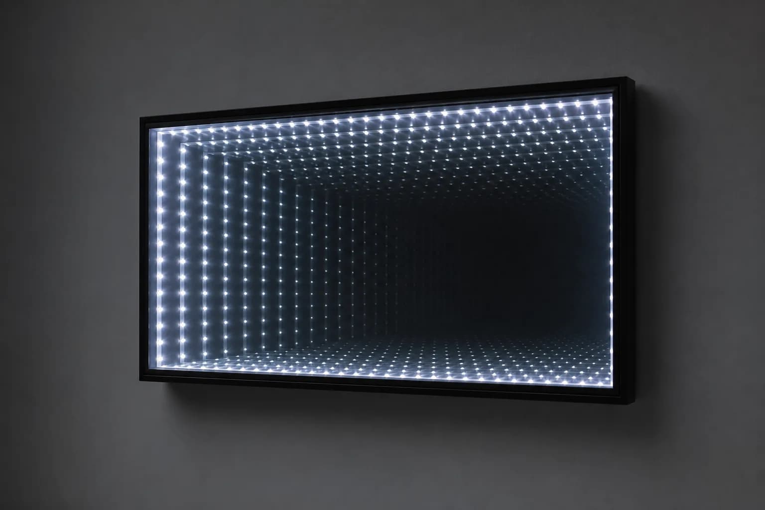
Standard Focal Panels
Fixed-size, ready-to-order standard infinity mirror focal panels with standard drivers and mounting kits for fast, predictable projects.
View Standard Focal Panels details